The idea of gaining muscle and losing fat at the same time seems impossible because of three widely held misconceptions: (a) to gain muscle you need a calorie surplus; (b) to lose fat you need a calorie deficit; and (c) you cannot achieve a calorie surplus and deficit at the same time.
Not too long ago, unfortunately I was in the right position to do some self-experiments in order to try to gain muscle and concurrently lose fat, without steroids, keeping my weight essentially constant (within a range of a few lbs). This was because I was obese, and then reached a point in the fat loss stage where I could stop losing weight while attempting to lose fat. This is indeed difficult and slow, as muscle gain itself is slow, and it apparently becomes slower as one tries to restrict fat gain. Compounding that is the fact that self-experimentation invariably leads to some mistakes.
The photos below show how I looked toward the end of my transformation from obese to relatively lean (right), and then about 1.5 years after that (left). During this time I gained muscle and lost fat, in equal amounts. How do I know that? It is because my weight is the same in both photos, even though on the left my body fat percentage is approximately 5 points lower. I estimate it to be slightly over 12 percent (on the left). This translates into a difference of about 7.5 lbs, of “fat turning into muscle”, so to speak.
A previous post on my transformation from obese to relatively lean has more measurement details (). Interestingly, I am very close to being overweight, technically speaking, in both photos above! That is, in both photos I have a body mass index that is close to 25. In fact, after putting on even a small amount of muscle, like I did, it is very easy for someone to reach a body mass index of 25. See the table below, from the body mass index article on Wikipedia ().
As someone gains more muscle and remains lean, approaching his or her maximum natural muscular potential, that person will approach the limit between the overweight and obese areas on the figure above. This will happen even though the person may be fairly lean, say with a body fat percentage in the single digits for men and around 14-18 percent for women. This applies primarily to the 5’7’’ – 5’11’’ range; things get somewhat distorted toward the extremes.
Contrast this with true obesity, as in the photo below. This photo was taken when I was obese, at the beach. If I recall it properly, it was taken on the Atlantic City seashore, or a beach nearby. I was holding a bottle of regular soda, which is emblematic of the situation in which many people find themselves in today’s urban societies. It reminds me of a passage in Gary Taubes’s book “Good Calories, Bad Calories” (), where someone who had recently discovered the deliciousness of water sweetened with sugar wondered why anyone “of means” would drink plain water ever again.
Now, you may rightfully say that a body composition change of about 7.5 lbs in 1.5 years is pitiful. Indeed, there are some people, typically young men, who will achieve this in a few months without steroids. But they are relatively rare; Scooby has a good summary of muscle gain expectations (). As for me, I am almost 50 years old, an age where muscle gain is not supposed to happen at all. I tend to gain fat very easily, but not muscle. And I was obese not too long ago. My results should be at the very low end of the scale of accomplishment for most people doing the right things.
By the way, the idea that muscle gain cannot happen after 40 years of age or so is another misconception; even though aging seems to promote muscle loss and fat gain, in part due to natural hormonal changes. There is evidence that many men may experience of low point (i.e., a trough) in their growth hormone and testosterone levels in their mid-40s, possibly due to a combination of modern diet and lifestyle factors. Still, many men in their 50s and 60s have higher levels ().
And what are the right things to do if one wants to gain muscle and lose fat at the same time? In my next post I will discuss the misconceptions mentioned at the beginning of this post, and a simple approach for concurrently gaining muscle and losing fat. The discussion will be based on my own experience and that of several HCE () users. The approach relies heavily on individual customization; so it will probably be easier to understand than to implement. Strength training is part of this simple strategy.
One puzzling aspect of strength training, from an evolutionary perspective, is that people tend to be able to do a lot more of it than is optimal for them. And, when they do even a bit more than they should, muscle gain stalls or even regresses. The minimalists frequently have the best results.
Showing posts with label HCE. Show all posts
Monday, February 27, 2012
Monday, January 2, 2012
HCE user experience: The anabolic range may be better measured in seconds than repetitions
It is not uncommon for those who do weight training to see no gains over long periods of time for certain weight training exercises (e.g., overhead press), even while they experience gains in other types of exercise (e.g., regular squats).
HealthCorrelator for Excel (HCE) and its main outputs, coefficients of association and graphs (), have been helping some creative users identify the reasons why they see no gains, and break out of the stagnation periods.
It may be a good idea to measure the number of seconds of effort per set; in addition to other variables such as numbers of sets and repetitions, and the amount of weight lifted. In some cases, an inverted J curve, full or partial (just the left side of it), shows up suggesting that the number of seconds of effort in a particular type of weight training exercise is a better predictor of muscle gain than the number of repetitions used.
The inverted J curve is similar to the one discussed in a previous post on HCE used for weight training improvement, where the supercompensation phenomenon is also discussed ().
Repetitions in the 6-12 range are generally believed to lead to peak anabolic response, and this is generally true for weight training exercises conducted in good form and to failure. It is also generally believed that muscular effort should be maintained for 20 to 120 seconds for peak anabolic response.
The problem is that in certain cases not even 12 repetitions lead to at least 20 seconds of effort. This is usually the case when the repetitions are performed very quickly. There are a couple of good reasons why this may happen: the person has above-average muscular power, or the range of motion used is limited.
What is muscular power, and why would someone want to limit the range of motion used in a weight training exercise?
Muscular power is different from muscular strength, and is normally distributed (bell curve) across the population, like most human traints (). Muscular power is related to the speed with which an individual can move a certain amount of weight. Muscular strength is related to the amount of weight moved. Frequently people who perform amazing feats of strength, like Dennis Rogers (), have above-average muscular power.
As for limiting the range of motion used in a weight training exercise, one of the advantages of doing so is that it reduces the risk of injury, as a wise commenter pointed out here some time ago (). It also has the advantage of increasing the number of variations of an exercise that can be used at different points in time; which is desirable, as variation is critical for sustained supercompensation ().
The picture below is from a YouTube video clip showing champion natural bodybuilder Doug Miller performing 27 repetitions of the deadlift with 405 lbs (). Doug is one of the co-authors of the book Biology for Bodybuilders, which has been reviewed here ().
The point of showing the video clip above is that the range of repetitions used would be perceived as quite high by many bodybuilders, but is nevertheless the one leading to a peak anabolic response for Doug. If you pay careful attention to the video, you will notice that Doug completes the 27 repetitions in 45 seconds, well within the anabolic range. If he had completed only 12 repetitions, at about the same pace, he would have done that a few seconds before hitting the 20-second mark.
Doug completes those 27 repetitions relatively quickly, because he has above-average muscular power, in addition to having above-average muscular strength.
HealthCorrelator for Excel (HCE) and its main outputs, coefficients of association and graphs (), have been helping some creative users identify the reasons why they see no gains, and break out of the stagnation periods.
It may be a good idea to measure the number of seconds of effort per set; in addition to other variables such as numbers of sets and repetitions, and the amount of weight lifted. In some cases, an inverted J curve, full or partial (just the left side of it), shows up suggesting that the number of seconds of effort in a particular type of weight training exercise is a better predictor of muscle gain than the number of repetitions used.
The inverted J curve is similar to the one discussed in a previous post on HCE used for weight training improvement, where the supercompensation phenomenon is also discussed ().
Repetitions in the 6-12 range are generally believed to lead to peak anabolic response, and this is generally true for weight training exercises conducted in good form and to failure. It is also generally believed that muscular effort should be maintained for 20 to 120 seconds for peak anabolic response.
The problem is that in certain cases not even 12 repetitions lead to at least 20 seconds of effort. This is usually the case when the repetitions are performed very quickly. There are a couple of good reasons why this may happen: the person has above-average muscular power, or the range of motion used is limited.
What is muscular power, and why would someone want to limit the range of motion used in a weight training exercise?
Muscular power is different from muscular strength, and is normally distributed (bell curve) across the population, like most human traints (). Muscular power is related to the speed with which an individual can move a certain amount of weight. Muscular strength is related to the amount of weight moved. Frequently people who perform amazing feats of strength, like Dennis Rogers (), have above-average muscular power.
As for limiting the range of motion used in a weight training exercise, one of the advantages of doing so is that it reduces the risk of injury, as a wise commenter pointed out here some time ago (). It also has the advantage of increasing the number of variations of an exercise that can be used at different points in time; which is desirable, as variation is critical for sustained supercompensation ().
The picture below is from a YouTube video clip showing champion natural bodybuilder Doug Miller performing 27 repetitions of the deadlift with 405 lbs (). Doug is one of the co-authors of the book Biology for Bodybuilders, which has been reviewed here ().
The point of showing the video clip above is that the range of repetitions used would be perceived as quite high by many bodybuilders, but is nevertheless the one leading to a peak anabolic response for Doug. If you pay careful attention to the video, you will notice that Doug completes the 27 repetitions in 45 seconds, well within the anabolic range. If he had completed only 12 repetitions, at about the same pace, he would have done that a few seconds before hitting the 20-second mark.
Doug completes those 27 repetitions relatively quickly, because he has above-average muscular power, in addition to having above-average muscular strength.
Monday, December 12, 2011
Finding your sweet spot for muscle gain with HCE
In order to achieve muscle gain, one has to repeatedly hit the “supercompensation” window, which is a fleeting period of time occurring at some point in the muscle recovery phase after an intense anaerobic exercise session. The figure below, from Vladimir Zatsiorsky’s and William Kraemer’s outstanding book Science and Practice of Strength Training () provides an illustration of the supercompensation idea. Supercompensation is covered in more detail in a previous post ().
Trying to hit the supercompensation window is a common denominator among HealthCorrelator for Excel (HCE) users who employ the software () to maximize muscle gain. (That is, among those who know and subscribe to the theory of supercompensation.) This post outlines what I believe is a good way of doing that while avoiding some pitfalls. The data used in the example that follows has been created by me, and is based on a real case. I disguised the data, simplified it, added error etc. to make the underlying method relatively easy to understand, and so that the data cannot be traced back to its “real case” user (for privacy).
Let us assume that John Doe is an intermediate weight training practitioner. That is, he has already gone through the beginning stage where most gains come from neural adaptation. For him, new gains in strength are a reflection of gains in muscle mass. The table below summarizes the data John obtained when he decided to vary the following variables in order to see what effects they have on his ability to increase the weight with which he conducted the deadlift () in successive exercise sessions:
- Number of rest days in between exercise sessions (“Days of rest”).
- The amount of weight he used in each deadlift session (“Deadlift weight”).
- The amount of weight he was able to add to the bar each session (“Delta weight”).
- The number of deadlift sets and reps (“Deadlift sets” and “Deadlift reps”, respectively).
- The total exercise volume in each session (“Deadlift volume”). This was calculated as follows: “Deadlift weight” x “Deadlift sets” x “Deadlift reps”.
John’s ability to increase the weight with which he conducted the deadlift in each session is measured as “Delta weight”. That was his main variable of interest. This may not look like an ideal choice at first glance, as arguably “Deadlift volume” is a better measure of total effort and thus actual muscle gain. The reality is that this does not matter much in his case, because: John had long rest periods within sets, of around 5 minutes; and he made sure to increase the weight in each successive session as soon as he felt he could, and by as much as he could, thus never doing more than 24 reps. If you think that the number of reps employed by John is too high, take a look at a post in which I talk about Doug Miller and his ideas on weight training ().
Below are three figures, with outputs from HCE: a table showing the coefficients of association between “Delta weight” and the other variables, and two graphs showing the variation of “Delta weight” against “Deadlift volume” and “Days of rest”. As you can see, nothing seems to be influencing “Delta weight” strongly enough to reach the 0.6 level that I recommend as the threshold for a “real effect” to be used in HCE analyses. There are two possibilities here: it is what it looks it is, that is, none of the variables influence “Delta weight”; or there are effects, but they do not show up in the associations table (as associations equal to or greater than 0.6) because of nonlinearity.
The graph of “Delta weight” against “Deadlift volume” is all over the place, suggesting a lack of association. This is true for the other variables as well, except “Days of rest”; the last graph above. That graph, of “Delta weight” against “Days of rest”, suggests the existence of a nonlinear association with the shape of an inverted J curve. This type of association is fairly common. In this case, it seems that “Delta weight” is maximized in the 6-7 range of “Days of rest”. Still, even varying things almost randomly, John achieved a solid gain over the time period. That was a 33 percent gain from the baseline “Deadlift weight”, a gain calculated as: (285-215)/215.
HCE, unlike WarpPLS (), does not take nonlinear relationships into consideration in the estimation of coefficients of association. In order to discover nonlinear associations, users have to inspect the graphs generated by HCE, as John did. Based on his inspection, John decided to changes things a bit, now working out on the right side of the J curve, with 6 or more “Days of rest”. That was difficult for John at first, as he was addicted to exercising at a much higher frequency; but after a while he became a “minimalist”, even trying very long rest periods.
Below are four figures. The first is a table summarizing the data John obtained for his second trial. The other three are outputs from HCE, analogous to those obtained in the first trial: a table showing the coefficients of association between “Delta weight” and the other variables, two graphs (side-by-side) showing “Delta weight” against “Deadlift sets” and “Deadlift reps”, and one graph of “Delta weight” against “Days of rest”. As you can see, “Days of rest” now influences “Delta weight” very strongly. The corresponding association is a very high -0.981! The negative sign means that “Delta weight” decreases as “Days of rest” increase. This does NOT mean that rest is not important; remember, John is now operating on the right side of the J curve, with 6 or more “Days of rest”.
The last graph above suggests that taking 12 or more “Days of rest” shifted things toward the end of the supercompensation window, in fact placing John almost outside of that window at 13 “Days of rest”. Even so, there was no loss of strength, and thus probably no muscle loss. Loss of strength would be suggested by a negative “Delta weight”, which did not occur (the “Delta weight” went down to zero, at 13 “Days of rest”). The two graphs shown side-by-side suggest that 2 “Deadlift sets” seem to work just as well for John as 3 or 4, and that “Deadlift reps” in the 18-24 range also work well for John.
In this second trial, John achieved a better gain over a similar time period than in the first trial. That was a 36 percent gain from the baseline “Deadlift weight”, a gain calculated as: (355-260)/260. John started with a lower baseline than in the end of the first trial period, probably due to detraining, but achieved a final “Deadlift weight” that was likely very close to his maximum potential (at the reps used). Because of this, the 36 percent gain in the period is a lot more impressive than it looks, as it happened toward the end of a saturation curve (e.g., the far right end of a logarithmic curve).
One important thing to keep in mind is that if an HCE user identifies a nonlinear relationship of the J-curve type by inspecting the graphs like John did, in further analyses the focus should be on the right or left side of the curve by either: splitting the dataset into two, and running a separate analysis for each new dataset; or running a new trial, now sticking with a range of variation on the right or left side of the curve, as John did. The reason is that nonlinear relationships tend to distort the linear coefficients calculated by HCE, hiding a real relationship between two variables.
This is a very simplified example. Most serious bodybuilders will measure variations in a number of variables at the same time, for a number of different exercise types and formats, and for longer periods. That is, their “HealthData” sheet in HCE will be a lot more complex. They will also have multiple instances of HCE running on their computer. HCE is a collection of sheets and code that can be copied, and saved with different names. The default is “HCE_1_0.xls” or “HCE_1_0.xlsm”, depending on which version you are using. Each new instance of HCE may contain a different dataset for analysis, stored in the “HealthData” sheet.
It is strongly recommended that you keep your data in a separate set of sheets, as a backup. That is, do not store all your data in the “HealthData” sheets in different HCE instances. Also, when you copy your data into the “HealthData” sheet in HCE, copy only the values and formats, and NOT the formulas. If you copy the formulas, you may end up having some problems, as some of the cells in the “HealthData” sheet will not be storing values. I also recommend storing values for other types variables, particularly perception-based variables.
Examples of perception-based variables are: “Perceived stress”, “Perceived delayed onset muscle soreness (DOMS)”, and “Perceived non-DOMS pain”. These can be answered on Likert-type scales, such as scales going from 1 (very strongly disagree) to 7 (very strongly agree) in response to self-prepared question-statements like “I feel stressed out” (for “Perceived stress”). If you find that a variable like “Perceived non-DOMS pain” is associated with working out at a particular volume range, that may help you avoid serious injury in the future, as non-DOMS pain is not a very good sign (). You also may find that working out in the volume range that is associated with non-DOMS pain adds nothing in terms of muscle gain.
Generally speaking, I think that many people will find out that their sweet spot for muscle gain involves less frequent exercise at lower volumes than they think. Still, each individual is unique; there is no one quite like John. The relationship between “Delta weight” and “Days of rest” varies from person to person based on age; older folks generally require more rest. It also varies based on whether the person is dieting or not; less food intake leads to longer recovery periods. Women will probably see visible lower-body muscle gain, but very little visible upper-body muscle gain (in the absence of steroid use), even as they experience upper-body strength gains. Other variables of interest for both men and women may be body weight, body fat percentage, and perceived muscle tone.
Trying to hit the supercompensation window is a common denominator among HealthCorrelator for Excel (HCE) users who employ the software () to maximize muscle gain. (That is, among those who know and subscribe to the theory of supercompensation.) This post outlines what I believe is a good way of doing that while avoiding some pitfalls. The data used in the example that follows has been created by me, and is based on a real case. I disguised the data, simplified it, added error etc. to make the underlying method relatively easy to understand, and so that the data cannot be traced back to its “real case” user (for privacy).
Let us assume that John Doe is an intermediate weight training practitioner. That is, he has already gone through the beginning stage where most gains come from neural adaptation. For him, new gains in strength are a reflection of gains in muscle mass. The table below summarizes the data John obtained when he decided to vary the following variables in order to see what effects they have on his ability to increase the weight with which he conducted the deadlift () in successive exercise sessions:
- Number of rest days in between exercise sessions (“Days of rest”).
- The amount of weight he used in each deadlift session (“Deadlift weight”).
- The amount of weight he was able to add to the bar each session (“Delta weight”).
- The number of deadlift sets and reps (“Deadlift sets” and “Deadlift reps”, respectively).
- The total exercise volume in each session (“Deadlift volume”). This was calculated as follows: “Deadlift weight” x “Deadlift sets” x “Deadlift reps”.
John’s ability to increase the weight with which he conducted the deadlift in each session is measured as “Delta weight”. That was his main variable of interest. This may not look like an ideal choice at first glance, as arguably “Deadlift volume” is a better measure of total effort and thus actual muscle gain. The reality is that this does not matter much in his case, because: John had long rest periods within sets, of around 5 minutes; and he made sure to increase the weight in each successive session as soon as he felt he could, and by as much as he could, thus never doing more than 24 reps. If you think that the number of reps employed by John is too high, take a look at a post in which I talk about Doug Miller and his ideas on weight training ().
Below are three figures, with outputs from HCE: a table showing the coefficients of association between “Delta weight” and the other variables, and two graphs showing the variation of “Delta weight” against “Deadlift volume” and “Days of rest”. As you can see, nothing seems to be influencing “Delta weight” strongly enough to reach the 0.6 level that I recommend as the threshold for a “real effect” to be used in HCE analyses. There are two possibilities here: it is what it looks it is, that is, none of the variables influence “Delta weight”; or there are effects, but they do not show up in the associations table (as associations equal to or greater than 0.6) because of nonlinearity.
The graph of “Delta weight” against “Deadlift volume” is all over the place, suggesting a lack of association. This is true for the other variables as well, except “Days of rest”; the last graph above. That graph, of “Delta weight” against “Days of rest”, suggests the existence of a nonlinear association with the shape of an inverted J curve. This type of association is fairly common. In this case, it seems that “Delta weight” is maximized in the 6-7 range of “Days of rest”. Still, even varying things almost randomly, John achieved a solid gain over the time period. That was a 33 percent gain from the baseline “Deadlift weight”, a gain calculated as: (285-215)/215.
HCE, unlike WarpPLS (), does not take nonlinear relationships into consideration in the estimation of coefficients of association. In order to discover nonlinear associations, users have to inspect the graphs generated by HCE, as John did. Based on his inspection, John decided to changes things a bit, now working out on the right side of the J curve, with 6 or more “Days of rest”. That was difficult for John at first, as he was addicted to exercising at a much higher frequency; but after a while he became a “minimalist”, even trying very long rest periods.
Below are four figures. The first is a table summarizing the data John obtained for his second trial. The other three are outputs from HCE, analogous to those obtained in the first trial: a table showing the coefficients of association between “Delta weight” and the other variables, two graphs (side-by-side) showing “Delta weight” against “Deadlift sets” and “Deadlift reps”, and one graph of “Delta weight” against “Days of rest”. As you can see, “Days of rest” now influences “Delta weight” very strongly. The corresponding association is a very high -0.981! The negative sign means that “Delta weight” decreases as “Days of rest” increase. This does NOT mean that rest is not important; remember, John is now operating on the right side of the J curve, with 6 or more “Days of rest”.
The last graph above suggests that taking 12 or more “Days of rest” shifted things toward the end of the supercompensation window, in fact placing John almost outside of that window at 13 “Days of rest”. Even so, there was no loss of strength, and thus probably no muscle loss. Loss of strength would be suggested by a negative “Delta weight”, which did not occur (the “Delta weight” went down to zero, at 13 “Days of rest”). The two graphs shown side-by-side suggest that 2 “Deadlift sets” seem to work just as well for John as 3 or 4, and that “Deadlift reps” in the 18-24 range also work well for John.
In this second trial, John achieved a better gain over a similar time period than in the first trial. That was a 36 percent gain from the baseline “Deadlift weight”, a gain calculated as: (355-260)/260. John started with a lower baseline than in the end of the first trial period, probably due to detraining, but achieved a final “Deadlift weight” that was likely very close to his maximum potential (at the reps used). Because of this, the 36 percent gain in the period is a lot more impressive than it looks, as it happened toward the end of a saturation curve (e.g., the far right end of a logarithmic curve).
One important thing to keep in mind is that if an HCE user identifies a nonlinear relationship of the J-curve type by inspecting the graphs like John did, in further analyses the focus should be on the right or left side of the curve by either: splitting the dataset into two, and running a separate analysis for each new dataset; or running a new trial, now sticking with a range of variation on the right or left side of the curve, as John did. The reason is that nonlinear relationships tend to distort the linear coefficients calculated by HCE, hiding a real relationship between two variables.
This is a very simplified example. Most serious bodybuilders will measure variations in a number of variables at the same time, for a number of different exercise types and formats, and for longer periods. That is, their “HealthData” sheet in HCE will be a lot more complex. They will also have multiple instances of HCE running on their computer. HCE is a collection of sheets and code that can be copied, and saved with different names. The default is “HCE_1_0.xls” or “HCE_1_0.xlsm”, depending on which version you are using. Each new instance of HCE may contain a different dataset for analysis, stored in the “HealthData” sheet.
It is strongly recommended that you keep your data in a separate set of sheets, as a backup. That is, do not store all your data in the “HealthData” sheets in different HCE instances. Also, when you copy your data into the “HealthData” sheet in HCE, copy only the values and formats, and NOT the formulas. If you copy the formulas, you may end up having some problems, as some of the cells in the “HealthData” sheet will not be storing values. I also recommend storing values for other types variables, particularly perception-based variables.
Examples of perception-based variables are: “Perceived stress”, “Perceived delayed onset muscle soreness (DOMS)”, and “Perceived non-DOMS pain”. These can be answered on Likert-type scales, such as scales going from 1 (very strongly disagree) to 7 (very strongly agree) in response to self-prepared question-statements like “I feel stressed out” (for “Perceived stress”). If you find that a variable like “Perceived non-DOMS pain” is associated with working out at a particular volume range, that may help you avoid serious injury in the future, as non-DOMS pain is not a very good sign (). You also may find that working out in the volume range that is associated with non-DOMS pain adds nothing in terms of muscle gain.
Generally speaking, I think that many people will find out that their sweet spot for muscle gain involves less frequent exercise at lower volumes than they think. Still, each individual is unique; there is no one quite like John. The relationship between “Delta weight” and “Days of rest” varies from person to person based on age; older folks generally require more rest. It also varies based on whether the person is dieting or not; less food intake leads to longer recovery periods. Women will probably see visible lower-body muscle gain, but very little visible upper-body muscle gain (in the absence of steroid use), even as they experience upper-body strength gains. Other variables of interest for both men and women may be body weight, body fat percentage, and perceived muscle tone.
Monday, September 26, 2011
Calling self-experimentation N=1 is incorrect and misleading
This is not a post about semantics. Using “N=1” to refer to self-experimentation is okay, as long as one understands that self-experimentation is one of the most powerful ways to improve one’s health. Typically the term “N=1” is used in a demeaning way, as in: “It is just my N=1 experience, so it’s not worth much, but …” This is the reason behind this post. Using the “N=1” term to refer to self-experimentation in this way is both incorrect and misleading.
Calling self-experimentation N=1 is incorrect
The table below shows a dataset that is discussed in this YouTube video on HealthCorrelator for Excel (HCE). It refers to one single individual. Nearly all health-related datasets will look somewhat like this, with columns referring to health variables and rows referring to multiple measurements for the health variables. (This actually applies to datasets in general, including datasets about non-health-related phenomena.)
Often each individual measurement, or row, will be associated with a particular point in time, such as a date. This will characterize the measurement approach used as longitudinal, as opposed to cross-sectional. One example of the latter would be a dataset where each row referred to a different individual, with the data on all rows collected at the same point in time. Longitudinal health-related measurement is frequently considered superior to cross-sectional measurement in terms of the insights that it can provide.
As you can see, the dataset has 10 rows, with the top row containing the names of the variables. So this dataset contains nine rows of data, which means that in this dataset “N=9”, even though the data is for one single individual. To call this an “N=1” experiment is incorrect.
As a side note, an empty cell, like that on the top row for HDL cholesterol, essentially means that a measurement for that variable was not taken on that date, or that it was left out because of obvious measurement error (e.g., the value received from the lab was “-10”, which would be a mistake since nobody has a negative HDL cholesterol level). The N of the dataset as a whole would still be technically 9 in a situation like this, with only one missing cell on the row in question. But the software would typically calculate associations for that variable (HDL cholesterol) based on a sample of 8.
Calling self-experimentation N=1 is misleading
Calling self-experimentation “N=1”, meaning that the results of self-experimentation are not a good basis for generalization, is very misleading. But there is a twist. Those results may indeed not be a good basis for generalization to other people, but they provide a particularly good basis for generalization for you. It is often much safer to generalize based on self-experimentation, even with small samples (e.g., N=9).
The reason, as I pointed out in this interview with Jimmy Moore, is that data about oneself only tends to be much more uniform than data about a sample of individuals. When multiple individuals are included in an analysis, the number of sources of error (e.g., confounding variables, measurement problems) is much higher than when the analysis is based on one single individual. Thus analyses based on data from one single individual yield results that are more uniform and stable across the sample.
Moreover, analyses of data about a sample of individuals are typically summarized through averages, and those averages tend to be biased by outliers. There are always outliers in any dataset; you might possibly be one of them if you were part of a dataset, which would render the average results at best misleading, and at worst meaningless, to you. This is a point that has also been made by Richard Nikoley, who has been discussing self-experimentation for quite some time, in this very interesting video.
Another person who has been talking about self-experimentation, and showing how it can be useful in personal health management, is Seth Roberts. He and the idea of self-experimentation were prominently portrayed in this article on the New York Times. Check this video where Dr. Roberts talks about how he found out through self-experimentation that, among other things, consuming butter reduced his arterial plaque deposits. Plaque reduction is something that only rarely happens, at least in folks who follow the traditional American diet.
HCE generates coefficients of association and graphs at the click of a button, making it relatively easy for anybody to understand how his or her health variables are associated with one another, and thus what modifiable health factors (e.g., consumption of certain foods) could be causing health effects (e.g., body fact accumulation). It may also help you identify other, more counter-intuitive, links; such as between certain thought and behavior patterns (e.g., wealth accumulation thoughts, looking at the mirror multiple times a day) and undesirable mental states (e.g., depression, panic attacks).
Just keep in mind that you need to have at least some variation in all the variables involved. Without variation there is no correlation, and thus causation may remain hidden from view.
Calling self-experimentation N=1 is incorrect
The table below shows a dataset that is discussed in this YouTube video on HealthCorrelator for Excel (HCE). It refers to one single individual. Nearly all health-related datasets will look somewhat like this, with columns referring to health variables and rows referring to multiple measurements for the health variables. (This actually applies to datasets in general, including datasets about non-health-related phenomena.)
Often each individual measurement, or row, will be associated with a particular point in time, such as a date. This will characterize the measurement approach used as longitudinal, as opposed to cross-sectional. One example of the latter would be a dataset where each row referred to a different individual, with the data on all rows collected at the same point in time. Longitudinal health-related measurement is frequently considered superior to cross-sectional measurement in terms of the insights that it can provide.
As you can see, the dataset has 10 rows, with the top row containing the names of the variables. So this dataset contains nine rows of data, which means that in this dataset “N=9”, even though the data is for one single individual. To call this an “N=1” experiment is incorrect.
As a side note, an empty cell, like that on the top row for HDL cholesterol, essentially means that a measurement for that variable was not taken on that date, or that it was left out because of obvious measurement error (e.g., the value received from the lab was “-10”, which would be a mistake since nobody has a negative HDL cholesterol level). The N of the dataset as a whole would still be technically 9 in a situation like this, with only one missing cell on the row in question. But the software would typically calculate associations for that variable (HDL cholesterol) based on a sample of 8.
Calling self-experimentation N=1 is misleading
Calling self-experimentation “N=1”, meaning that the results of self-experimentation are not a good basis for generalization, is very misleading. But there is a twist. Those results may indeed not be a good basis for generalization to other people, but they provide a particularly good basis for generalization for you. It is often much safer to generalize based on self-experimentation, even with small samples (e.g., N=9).
The reason, as I pointed out in this interview with Jimmy Moore, is that data about oneself only tends to be much more uniform than data about a sample of individuals. When multiple individuals are included in an analysis, the number of sources of error (e.g., confounding variables, measurement problems) is much higher than when the analysis is based on one single individual. Thus analyses based on data from one single individual yield results that are more uniform and stable across the sample.
Moreover, analyses of data about a sample of individuals are typically summarized through averages, and those averages tend to be biased by outliers. There are always outliers in any dataset; you might possibly be one of them if you were part of a dataset, which would render the average results at best misleading, and at worst meaningless, to you. This is a point that has also been made by Richard Nikoley, who has been discussing self-experimentation for quite some time, in this very interesting video.
Another person who has been talking about self-experimentation, and showing how it can be useful in personal health management, is Seth Roberts. He and the idea of self-experimentation were prominently portrayed in this article on the New York Times. Check this video where Dr. Roberts talks about how he found out through self-experimentation that, among other things, consuming butter reduced his arterial plaque deposits. Plaque reduction is something that only rarely happens, at least in folks who follow the traditional American diet.
HCE generates coefficients of association and graphs at the click of a button, making it relatively easy for anybody to understand how his or her health variables are associated with one another, and thus what modifiable health factors (e.g., consumption of certain foods) could be causing health effects (e.g., body fact accumulation). It may also help you identify other, more counter-intuitive, links; such as between certain thought and behavior patterns (e.g., wealth accumulation thoughts, looking at the mirror multiple times a day) and undesirable mental states (e.g., depression, panic attacks).
Just keep in mind that you need to have at least some variation in all the variables involved. Without variation there is no correlation, and thus causation may remain hidden from view.
Monday, March 21, 2011
Health markers varying inexplicably? Do some detective work with HCE
John was overweight, out of shape, and experiencing fatigue. What did he do? He removed foods rich in refined carbohydrates and sugars from his diet. He also ditched industrial seed oils and started exercising. He used HealthCorrelator for Excel (HCE) to keep track of several health-related numbers over time (see figure below).
Over the period of time covered in the dataset, health markers steadily improved. For example, John’s HDL cholesterol went from a little under 40 mg/dl to just under 70; see chart below, one of many generated by HCE.
However, John’s blood pressure varied strangely during that time, as you can see on the chart below showing the variation of systolic blood pressure (SBP) against time. What could have been the reason for that? Salt intake is an unlikely culprit, as we’ve seen before.
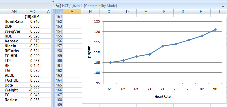
As it turns out, John knew that heart rate could influence blood pressure somewhat, and he also knew that his doctor’s office measured his heart rate regularly. So he got the data from his doctor's office. When he entered heart rate as a column into HCE, the reason for his blood pressure swings became clear, as you can see on the figure below.
On the left part of the figure above are the correlations between SBP and each of the other health-related variables John measured, which HCE lists in order of strength. Heart rate shows up at the top, with a high 0.946 correlation with SBP. On the right part of the figure is the chart of SBP against heart rate.
As you can see, John's heart rate, measured at the doctor's office, varied from 61 to 90 bpm. Given that, John decided to measure his resting heart rate. John’s resting heart rate, measured after waking up using a simple wrist watch, was 61 bpm.
Mystery solved! John’s blood pressure fluctuations were benign, and caused by fluctuations in heart rate.
If John's SBP had been greater than 140, which did not happen, this could be seen as an unusual example of irregular white coat hypertension.
If you are interested, this YouTube video clip discusses in more detail the case above, from HCE’s use perspective. It shows how the heart rate column was added to the dataset in HCE, how the software generated correlations and graphs, and how they were interpreted.
Reference
Kock, N. (2010). HealthCorrelator for Excel 1.0 User Manual. Laredo, Texas: ScriptWarp Systems.
Over the period of time covered in the dataset, health markers steadily improved. For example, John’s HDL cholesterol went from a little under 40 mg/dl to just under 70; see chart below, one of many generated by HCE.
However, John’s blood pressure varied strangely during that time, as you can see on the chart below showing the variation of systolic blood pressure (SBP) against time. What could have been the reason for that? Salt intake is an unlikely culprit, as we’ve seen before.
As it turns out, John knew that heart rate could influence blood pressure somewhat, and he also knew that his doctor’s office measured his heart rate regularly. So he got the data from his doctor's office. When he entered heart rate as a column into HCE, the reason for his blood pressure swings became clear, as you can see on the figure below.
On the left part of the figure above are the correlations between SBP and each of the other health-related variables John measured, which HCE lists in order of strength. Heart rate shows up at the top, with a high 0.946 correlation with SBP. On the right part of the figure is the chart of SBP against heart rate.
As you can see, John's heart rate, measured at the doctor's office, varied from 61 to 90 bpm. Given that, John decided to measure his resting heart rate. John’s resting heart rate, measured after waking up using a simple wrist watch, was 61 bpm.
Mystery solved! John’s blood pressure fluctuations were benign, and caused by fluctuations in heart rate.
If John's SBP had been greater than 140, which did not happen, this could be seen as an unusual example of irregular white coat hypertension.
If you are interested, this YouTube video clip discusses in more detail the case above, from HCE’s use perspective. It shows how the heart rate column was added to the dataset in HCE, how the software generated correlations and graphs, and how they were interpreted.
Reference
Kock, N. (2010). HealthCorrelator for Excel 1.0 User Manual. Laredo, Texas: ScriptWarp Systems.
Monday, January 24, 2011
HealthCorrelator for Excel (HCE) is now publicly available for free trial
HealthCorrelator for Excel (HCE) is now publicly available for download and use on a free trial basis. For those users who decide to buy it after trying, licenses are available for individuals and organizations. If you are a gym member, consider asking your gym to buy an organizational site license; this would allow the gym to distribute individual licenses at no cost to you and your colleagues.
HCE is a user-friendly Excel-based software that unveils important associations among health variables at the click of a button. Here are some of its main features:
- Easy to use yet powerful health management software.
- Estimates associations among any number of health variables.
- Automatically orders associations by decreasing absolute strength.
- Graphs relationships between pairs of health variables, for all possible combinations.
The beta testing was successfully completed, with fairly positive results. (Thank you beta testers!) Among beta testers were Mac users. The main request from beta testers was for more illustrative material on how to use HCE for specific purposes, such as losing body fat or managing blood glucose levels. This will be coming in the future in the form of posts and linked material.
To download a free trial version, good for 30 use sessions (which is quite a lot!), please visit the HealthCorrelator.com web site. There you will also find the software’s User Manual and various links to demo YouTube videos. You can also download sample datasets to try the software’s main features.
HCE is a user-friendly Excel-based software that unveils important associations among health variables at the click of a button. Here are some of its main features:
- Easy to use yet powerful health management software.
- Estimates associations among any number of health variables.
- Automatically orders associations by decreasing absolute strength.
- Graphs relationships between pairs of health variables, for all possible combinations.
The beta testing was successfully completed, with fairly positive results. (Thank you beta testers!) Among beta testers were Mac users. The main request from beta testers was for more illustrative material on how to use HCE for specific purposes, such as losing body fat or managing blood glucose levels. This will be coming in the future in the form of posts and linked material.
To download a free trial version, good for 30 use sessions (which is quite a lot!), please visit the HealthCorrelator.com web site. There you will also find the software’s User Manual and various links to demo YouTube videos. You can also download sample datasets to try the software’s main features.
Sunday, November 28, 2010
HealthCorrelator for Excel 1.0 (HCE): Call for beta testers
This call is closed. Beta testing has been successfully completed. HealthCorrelator for Excel (HCE) is now publicly available for download and use on a free trial basis. For those users who decide to buy it after trying, licenses are available for individuals and organizations.
To download a free trial version – as well as get the User Manual, view demo YouTube videos, and download and try sample datasets – visit the HealthCorrelator.com web site.
Monday, November 22, 2010
Human traits are distributed along bell curves: You need to know yourself, and HCE can help
Most human traits (e.g., body fat percentage, blood pressure, propensity toward depression) are influenced by our genes; some more than others. The vast majority of traits are also influenced by environmental factors, the “nurture” part of the “nature-nurture” equation. Very few traits are “innate”, such as blood type.
This means that manipulating environmental factors, such as diet and lifestyle, can strongly influence how the traits are finally expressed in humans. But each individual tends to respond differently to diet and lifestyle changes, because each individual is unique in terms of his or her combination of “nature” and “nurture”. Even identical twins are different in that respect.
When plotted, traits that are influenced by our genes are distributed along a bell-shaped curve. For example, a trait like body fat percentage, when measured in a population of 1000 individuals, will yield a distribution of values that will look like a bell-shaped distribution. This type of distribution is also known in statistics as a “normal” distribution.
Why is that?
The additive effect of genes and the bell curve
The reason is purely mathematical. A measurable trait, like body fat percentage, is usually influenced by several genes. (Sometimes individual genes have a very marked effect, as in genes that “switch on or off” other genes.) Those genes appear at random in a population, and their various combinations spread in response to selection pressures. Selection pressures usually cause a narrowing of the bell-shaped curve distributions of traits in populations.
The genes interact with environmental influences, which also have a certain degree of randomness. The result is a massive combined randomness. It is this massive randomness that leads to the bell-curve distribution. The bell curve itself is not random at all, which is a fascinating aspect of this phenomenon. From “chaos” comes “order”. A bell curve is a well-defined curve that is associated with a function, the probability density function.
The underlying mathematical reason for the bell shape is the central limit theorem. The genes are combined in different individuals as combinations of alleles, where each allele is a variation (or mutation) of a gene. An allele set, for genes in different locations of the human DNA, forms a particular allele combination, called a genotype. The alleles combine their effects, usually in an additive fashion, to influence a trait.
Here is a simple illustration. Let us say one generates 1000 random variables, each storing 10 random values going from 0 to 1. Then the values stored in each of the 1000 random variables are added. This mimics the additive effect of 10 genes with random allele combinations. The result are numbers ranging from 1 to 10, in a population of 1000 individuals; each number is analogous to an allele combination. The resulting histogram, which plots the frequency of each allele combination (or genotype) in the population, is shown on the figure bellow. Each allele configuration will “push for” a particular trait range, making the trait distribution also have the same bell-shaped form.
The bell curve, research studies, and what they mean for you
Studies of the effects of diet and exercise on health variables usually report their results in terms of average responses in a group of participants. Frequently two groups are used, one control and one treatment. For example, in a diet-related study the control group may follow the Standard American Diet, and the treatment group may follow a low carbohydrate diet.
However, you are not the average person; the average person is an abstraction. Research on bell curve distributions tells us that there is about a 68 percentage chance that you will fall within a 1 standard deviation from the average, to the left or the right of the “middle” of the bell curve. Still, even a 0.5 standard deviation above the average is not the average. And, there is approximately a 32 percent chance that you will not be within the larger -1 to 1 standard deviation range. If this is the case, the average results reported may be close to irrelevant for you.
Average results reported in studies are a good starting point for people who are similar to the studies’ participants. But you need to generate your own data, with the goal of “knowing yourself through numbers” by progressively analyzing it. This is akin to building a “numeric diary”. It is not exactly an “N=1” experiment, as some like to say, because you can generate multiple data points (e.g., N=200) on how your body alone responds to diet and lifestyle changes over time.
HealthCorrelator for Excel (HCE)
I think I have finally been able to develop a software tool that can help people do that. I have been using it myself for years, initially as a prototype. You can see the results of my transformation on this post. The challenge for me was to generate a tool that was simple enough to use, and yet powerful enough to give people good insights on what is going on with their body.
The software tool is called HealthCorrelator for Excel (HCE). It runs on Excel, and generates coefficients of association (correlations, which range from -1 to 1) among variables and graphs at the click of a button.
This 5-minute YouTube video shows how the software works in general, and this 10-minute video goes into more detail on how the software can be used to manage a specific health variable. These two videos build on a very small sample dataset, and their focus is on HDL cholesterol management. Nevertheless, the software can be used in the management of just about any health-related variable – e.g., blood glucose, triglycerides, muscle strength, muscle mass, depression episodes etc.
You have to enter data about yourself, and then the software will generate coefficients of association and graphs at the click of a button. As you can see from the videos above, it is very simple. The interpretation of the results is straightforward in most cases, and a bit more complicated in a smaller number of cases. Some results will probably surprise users, and their doctors.
For example, a user who is a patient may be able to show to a doctor that, in the user’s specific case, a diet change influences a particular variable (e.g., triglycerides) much more strongly than a prescription drug or a supplement. More posts will be coming in the future on this blog about these and other related issues.
This means that manipulating environmental factors, such as diet and lifestyle, can strongly influence how the traits are finally expressed in humans. But each individual tends to respond differently to diet and lifestyle changes, because each individual is unique in terms of his or her combination of “nature” and “nurture”. Even identical twins are different in that respect.
When plotted, traits that are influenced by our genes are distributed along a bell-shaped curve. For example, a trait like body fat percentage, when measured in a population of 1000 individuals, will yield a distribution of values that will look like a bell-shaped distribution. This type of distribution is also known in statistics as a “normal” distribution.
Why is that?
The additive effect of genes and the bell curve
The reason is purely mathematical. A measurable trait, like body fat percentage, is usually influenced by several genes. (Sometimes individual genes have a very marked effect, as in genes that “switch on or off” other genes.) Those genes appear at random in a population, and their various combinations spread in response to selection pressures. Selection pressures usually cause a narrowing of the bell-shaped curve distributions of traits in populations.
The genes interact with environmental influences, which also have a certain degree of randomness. The result is a massive combined randomness. It is this massive randomness that leads to the bell-curve distribution. The bell curve itself is not random at all, which is a fascinating aspect of this phenomenon. From “chaos” comes “order”. A bell curve is a well-defined curve that is associated with a function, the probability density function.
The underlying mathematical reason for the bell shape is the central limit theorem. The genes are combined in different individuals as combinations of alleles, where each allele is a variation (or mutation) of a gene. An allele set, for genes in different locations of the human DNA, forms a particular allele combination, called a genotype. The alleles combine their effects, usually in an additive fashion, to influence a trait.
Here is a simple illustration. Let us say one generates 1000 random variables, each storing 10 random values going from 0 to 1. Then the values stored in each of the 1000 random variables are added. This mimics the additive effect of 10 genes with random allele combinations. The result are numbers ranging from 1 to 10, in a population of 1000 individuals; each number is analogous to an allele combination. The resulting histogram, which plots the frequency of each allele combination (or genotype) in the population, is shown on the figure bellow. Each allele configuration will “push for” a particular trait range, making the trait distribution also have the same bell-shaped form.
The bell curve, research studies, and what they mean for you
Studies of the effects of diet and exercise on health variables usually report their results in terms of average responses in a group of participants. Frequently two groups are used, one control and one treatment. For example, in a diet-related study the control group may follow the Standard American Diet, and the treatment group may follow a low carbohydrate diet.
However, you are not the average person; the average person is an abstraction. Research on bell curve distributions tells us that there is about a 68 percentage chance that you will fall within a 1 standard deviation from the average, to the left or the right of the “middle” of the bell curve. Still, even a 0.5 standard deviation above the average is not the average. And, there is approximately a 32 percent chance that you will not be within the larger -1 to 1 standard deviation range. If this is the case, the average results reported may be close to irrelevant for you.
Average results reported in studies are a good starting point for people who are similar to the studies’ participants. But you need to generate your own data, with the goal of “knowing yourself through numbers” by progressively analyzing it. This is akin to building a “numeric diary”. It is not exactly an “N=1” experiment, as some like to say, because you can generate multiple data points (e.g., N=200) on how your body alone responds to diet and lifestyle changes over time.
HealthCorrelator for Excel (HCE)
I think I have finally been able to develop a software tool that can help people do that. I have been using it myself for years, initially as a prototype. You can see the results of my transformation on this post. The challenge for me was to generate a tool that was simple enough to use, and yet powerful enough to give people good insights on what is going on with their body.
The software tool is called HealthCorrelator for Excel (HCE). It runs on Excel, and generates coefficients of association (correlations, which range from -1 to 1) among variables and graphs at the click of a button.
This 5-minute YouTube video shows how the software works in general, and this 10-minute video goes into more detail on how the software can be used to manage a specific health variable. These two videos build on a very small sample dataset, and their focus is on HDL cholesterol management. Nevertheless, the software can be used in the management of just about any health-related variable – e.g., blood glucose, triglycerides, muscle strength, muscle mass, depression episodes etc.
You have to enter data about yourself, and then the software will generate coefficients of association and graphs at the click of a button. As you can see from the videos above, it is very simple. The interpretation of the results is straightforward in most cases, and a bit more complicated in a smaller number of cases. Some results will probably surprise users, and their doctors.
For example, a user who is a patient may be able to show to a doctor that, in the user’s specific case, a diet change influences a particular variable (e.g., triglycerides) much more strongly than a prescription drug or a supplement. More posts will be coming in the future on this blog about these and other related issues.
Labels:
bell curve,
evolution,
genes,
genetics,
HCE,
standard deviation,
statistics
Subscribe to:
Posts (Atom)